Custom E-Flyer Layout Tips
Posted on November 9th, 2015 by Mark Hayden | Categories: Marketing & ZipTips
In addition to the many in-house e-flyer products we at ZYF offer, we are also fully capable of sending out custom e-flyer designs uploaded by our customers.
This is a popular option for agents who already have custom e-flyer designs on-hand, and those who have access to their own in-house or contracted designers. These orders are just as easy for us to send out as our own in-house designs, but we still have some important tips to ensure things go smoothly.
All the e-flyers sent out by Zipyourflyer.com must meet certain length and width requirements, to minimize technical issues arising from flyers being too small or too large. Broadly the problem breaks down like this: if a flyer is too large, there can be issues displaying in certain e-mail clients. If the image is too small, our code may not display it correctly, leaving unappealing gaps.
So, what is the best size for an uploaded custom e-flyer?
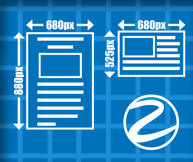
For your custom e-flyer we strongly recommend a layout of 8.5 x 11 inches or the equivalent measurements thereof. In principal we have some flexibility, but maintaining the 8.5 x 11 standard will help ensure the rapid coding and delivery of your custom e-flyer.
If your custom e-flyer image is in a landscape format, it can still be made to work, though the image can often appear smaller than desired, since with width of our flyers is always at 680 pixels, while the length can be more flexible. This means that portrait flyers has a lot more space to work with.
We strongly advise you to include any links you wish to appear on the flyer in your design notes. This will make it much easier for our designers to know what links you want, instead of having to “hunt” for them on the custom e-flyer image.
Remember: if we have to shrink or “blow up” your custom e-flyer image, the quality will suffer. Keep in mind that often custom e-flyer images do end up shrunk down, and this can decrease the legibility of the text. It is not uncommon for e-flyer text to start out at 12 or 14 font, and end up at 3 font by the time we finish resizing it. Starting with a larger font can often make an important difference in legibility, at the expense of volume.
3 thoughts on “Custom E-Flyer Layout Tips”
Comments are closed.
Your comment is awaiting moderation.
December 2, 2015 at 6:50 am
I NEED SAME HELP IS THE FIRST TIME THE I LIKE TO USE THIS TYPE OF MARKETING.
IS POSSIBLE TO HAVE ALL INFORMATION IN SPANISH? AND IF NOT YOU HAVE ANY PART TIME STUDENT OR PERSON THAT WE AN HELP TO LISTING MANY FLYER IN YOUR ZIP MY WIVE IS ASSOCIATE WITH TRUMP INTERNATIONAL REALTY FROM MIAMI FL AND SHE NEED HELP TO BECAUS THE OFFICE MARKETING IS IN NY.
REGARDS
UGO VALENTI
Hello Ugo!
We do accommodate flyers in other languages, both our in-house designs and custom flyers that our customers provide for us to send to our lists.
When we send these types of flyers, we always send an English version as the primary message, and embed a special link that allows the recipient to view the flyer in another language. However, both versions of the text have to be submitted for this type of order, as we do not offer translation services.
I hope this answers your question!
Mark
Hi, Yes that is good info regarding email flyer design.